Overview
The stakeholders are requesting an app that will help the commuter to look up which bus will be coming next. The app will also provide clarification of the next bus to arrive. In order to confirm the issue and provide the best results we used three different kinds of research.
The first was a competitive analysis. I looked at a competitive transportation app from Google, Google maps. The competitor did a great job at providing the commuter with different options, such as, a feature to allow the person to simulate a trip and choose the best form of transportation. This transportation could be public, bus or train, or private, personal car. They, however, do not show the time the different types of public transportation will get to a needed decision. It focused on the time it would take for the commuter to get from one place to the next.
The second form of research was surveys provided to individuals who use public transportation and use the app as an informative tool. more than half of the commuters included in the survey used the bus to get to and from work.
The final form of research was a user interview. This was used to expand upon the survey results, the commuter provided more context to what they feel is important in a bus application and what their current transportation app falls short
Roles and responsibilities
This case study was conducted by Angela Joseph-Pauline. They were in charge of conducting the research, designing, and developing the final outcome.
Project goal
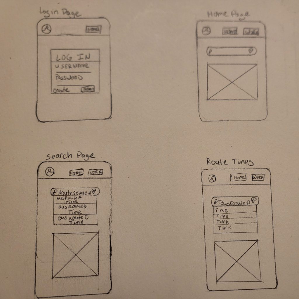
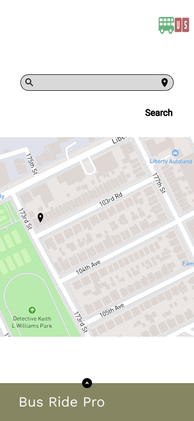
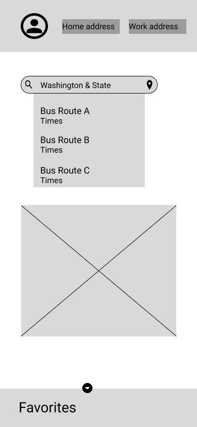
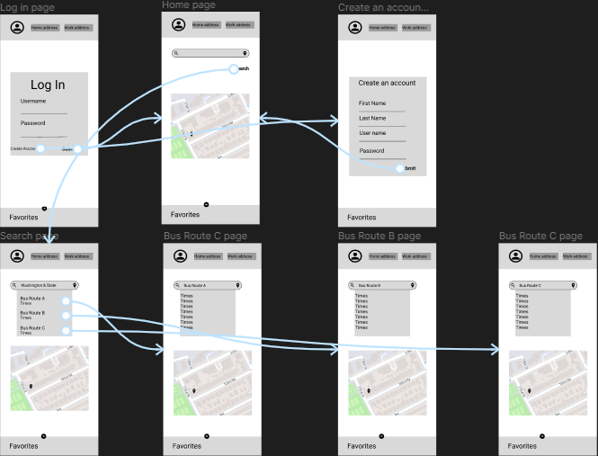
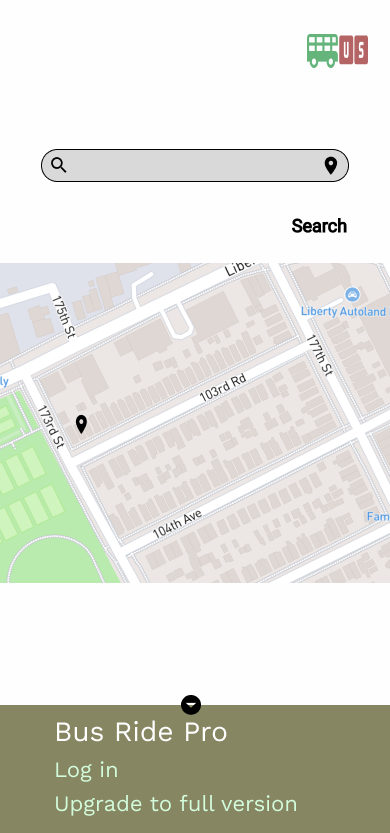
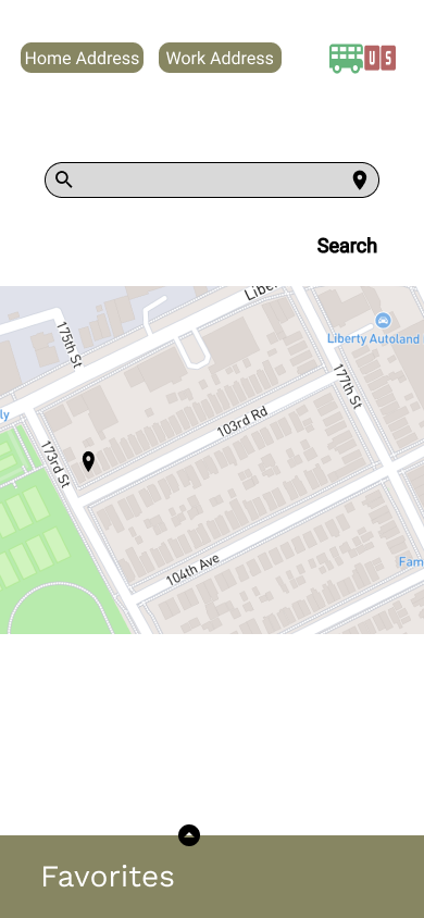
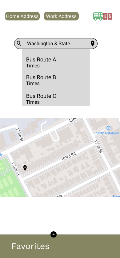
The goal of this project is to provide an app where a commuter can look up their preferred bus route and the associated time. The app should provide the commuter with different time-frames of bus arrivals and allow for different bus route options, Incase a transfer is needed.
Users and audience

Scope and constraints
The scope of this project was small due to financial and public access limitations. I was able to get a cohort of 20 individuals who would fit the consumer base of similar apps. With their help and assessment of similar apps I was able to identify the pain points of the project and work towards the iteration. The combination of all 3 research methods allowed me to work through the solution with our initial ideas and make changes as needed.
Research Process
Competative Analysis
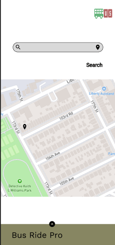
I began with a competitive analysis of Google Maps and the Transit App. Google Maps did a great job at providing the commuter with different options, such as a feature to allow the person to simulate a trip and choose the best form of transportation. This transportation could be public, bus or train, or private, personal car. They have a map as the center point of the app, this allows the user to see where they are and also allows them to look at their final destination.
They, however, do not show the time the different types of public transportation will get to a needed destination. It focused on the time it would take for the commuter to get from one place to the next. Allowing the user to see the time of the next bus would allow them to make a better plan for their trip.
On the other hand, the Transit app focuses on public transportation only. It provides what public transportation options are near you, bus or train, etc… Similar to Google Maps the main page’s main focus is the map, which allows users to visualize where they are. The bottom of the app shows the options in your area, including the time for the next bus, train, or rideshare.
User Survey
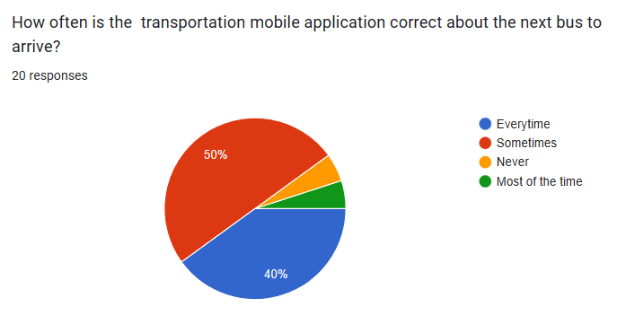
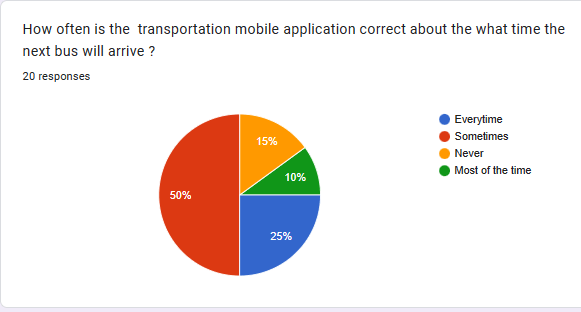
As per users, about 50% of the users indicate that the app they use is only somewhat accurate about both the arrival time of the bus and the next bus to arrive.
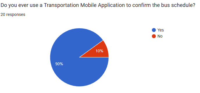
This is particularly troubling because 90% of the individuals who were surveyed used the mobile app to look up the current bus schedule. The goal of my app was to provide the user with an accurate schedule to predict when the bus would arrive, as well as which bus will be arriving.
Userbility Testing

The usability testing found a few functional updates and changes were updated to accommodate those requests, as seen in the chart above.
My first attempt at the design did not pass the color contrast test. When I originally attempted to User test it the feedback indicated that I should update the color scheme to allow for accessibility.
Outcomes and results

In the final product, I change the colors to have more of a contrast. The color contrast is not in compliance with WCAG regulation for both small and large text. It was also in compliance for it’s UI components.
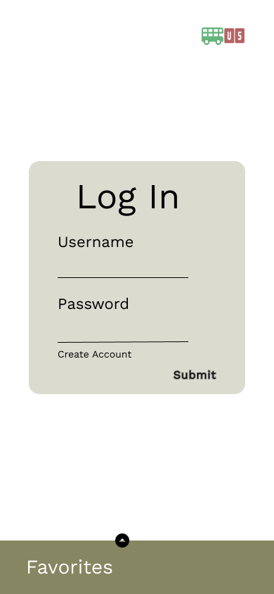
I also able to adept my other User feedback. I rounded the buttons, updated the alignment of the text and provided a non-sign in option, for those who do not wnat to to provide their personal information. I was able to use user feedback in usbility testing and surveys. I also used the competitor’s design to give an idea of where to start the design. The research I did provided great insight of how to make this case study flow in the correct direction.
Website Links
